
Overview
Modernizing a pharmacy giant's digital storefront
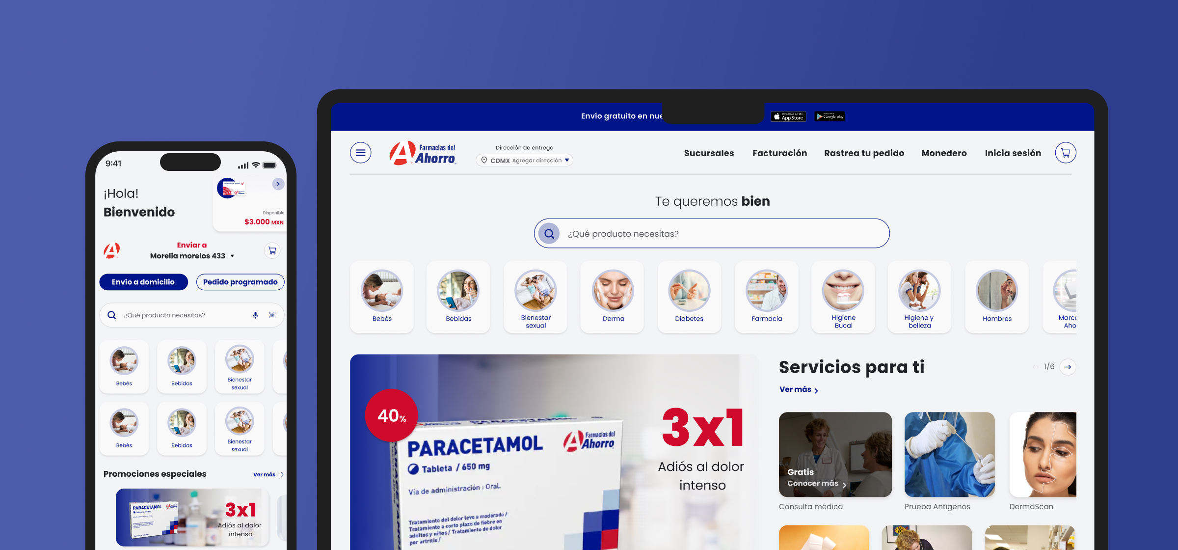
Farmacias del Ahorro is Mexico's largest pharmacy chain — over 1,700 stores, millions of monthly digital visitors, and a catalog of thousands of health and personal care SKUs. Despite that scale, their e-commerce platform was losing more than 70% of customers before checkout completion.
Working via Wizeline, I led the redesign of the end-to-end shopping experience — rebuilding the checkout flow, restructuring the product taxonomy, and establishing a design system to bring consistency across web, mobile, and CMS.
Research
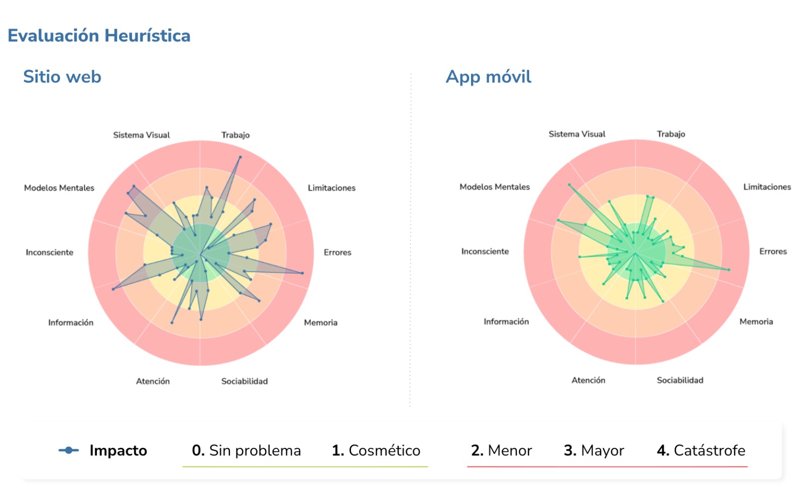
Heuristic evaluation across web and mobile
Before touching a single wireframe, I ran a full heuristic evaluation across both platforms — mapping severity scores across 9 cognitive dimensions. The radar charts made it immediately clear to stakeholders where the platform was failing and why. This audit became the strategic brief for the entire redesign.
Information architecture
Restructuring the product taxonomy
The original catalog buried products under confusing categories. I rebuilt the taxonomy with card sorting and tree testing, so customers could reach medication and health products in fewer, clearer steps.
Checkout funnel
Turning a leaky checkout into a conversion path
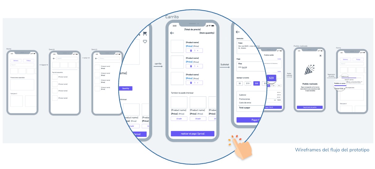
I broke the checkout into its individual stages to see exactly where customers dropped off, then redesigned each step. Completion climbed from 30% to 65% across the funnel.
Process
From audit to a unified system
Results
A faster, clearer path to purchase
The redesigned platform lifted checkout completion from under 30% to 65% — more than doubling the conversion rate — while cutting navigation time to find products by 28%. The combined impact drove a 75% improvement in online sales performance for one of Mexico's largest pharmacy chains.